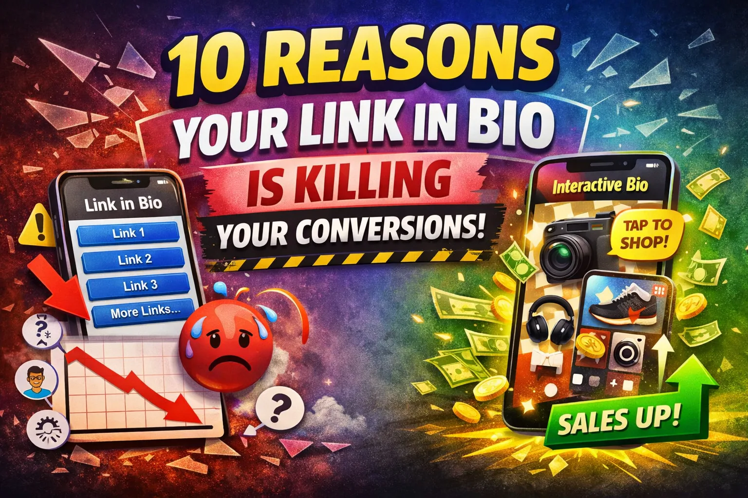
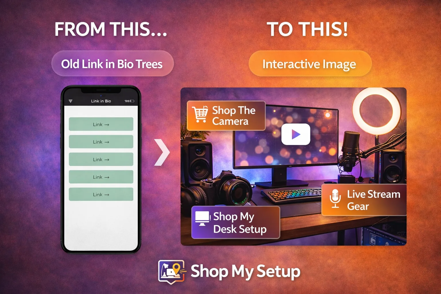
If your "link in bio" is a generic list of links, you're making people work harder than they need to. Conversions don't die because your audience isn't interested — they die because your funnel is adding friction at the exact moment intent is highest.
Executive summary: Link-lists underperform because they introduce (1) extra steps, (2) too many choices, and (3) slow, non-contextual experiences. A higher-converting alternative is an interactive image where each tap maps to the exact product/content shown.
1) You're forcing extra clicks (and every click leaks intent)
A classic link-list turns one high-intent tap into multiple micro-decisions: tap bio → scan list → tap again → wait for a new page → decide again. That's not "simple." It's a multi-step funnel.
Fix: Replace the list with a single interactive image that matches the content they just consumed. When a viewer taps what they see (camera, outfit, product, resource), they're done.
2) Your page loads too slowly on mobile
Mobile attention is fragile. Google reports that 53% of visits are abandoned if a mobile site takes longer than 3 seconds to load. Even worse, as load time increases from 1 second to 10 seconds, the probability of a bounce can rise by 123%. For marketers, a 1-second delay can impact conversions by up to 20% in some categories.
Fix: Use a lightweight, mobile-first destination that loads fast and reduces steps. Interactive images can act as a "visual landing page" with fewer elements and fewer redirects.
3) Choice overload causes decision paralysis
More links feels helpful — but it often reduces action. In the well-known "jam" choice study, shoppers were far more likely to buy when presented with a small set of options (6) versus a large set (24), with purchase rates commonly summarized as 30% vs 3% depending on how the result is reported. The core point holds: too many choices can demotivate action.
Fix: Don't make people decide what to click. Make the click obvious: one image, a few hotspots, and only the links that match the user's intent from the post they just watched.
4) The options aren't contextual to what they just watched
Most link-in-bio pages are the same regardless of what someone viewed. But buyers don't think in menus — they think in moments: "What camera is that?" "Where did you get that lamp?" "Which mic are you using?"
Fix: Use a destination that mirrors the content visually. Interactive images convert "what is that?" into a direct tap. Context reduces cognitive load and increases follow-through.
5) You're training people to "browse," not buy
A link list feels like a directory. Directories encourage browsing behavior: scrolling, comparing, leaving. That's the opposite of what you want when someone is already interested enough to click your bio.
Fix: Swap "directory mode" for "tap-to-action mode." With an interactive image, the tap is the decision, not the start of a scavenger hunt.
6) You're losing clicks behind platform UI friction
Platforms are improving profile linking (for example, Instagram moved to supporting multiple bio links), but there's still friction: links can be collapsed behind UI like "see more," and the experience is not consistent across platforms. In practice, creators still rely on dedicated "link destinations" to control presentation, analytics, and flow.
Fix: Use one consistent destination across platforms — optimized for mobile and designed for conversion.
7) You're losing trust with generic layouts and third-party branding
When your bio link sends people to a generic, templated link list (especially on a third-party domain), you introduce a subtle trust tax. The user asked for you; they landed on a generic hub that looks like everyone else's.
Fix: Present a branded, creator-first experience. A visual "shop/gear/setup" style interactive image feels native to what your audience wanted, which improves confidence and reduces drop-off.
8) You're measuring clicks, not outcomes
Many link-in-bio tools emphasize basic metrics like "views" and "clicks." That's useful — but it's not the whole picture. A higher-performing system helps you understand what people intended and which items are actually driving action.
Fix: Structure your destination so each tap maps cleanly to an item (product/content), then optimize based on what is actually being clicked. Interactive images naturally produce cleaner "item-level intent" data than a long list of text links.
9) Your best offers are buried under low-intent links
A typical link list mixes everything: newsletter, tips, merch, affiliates, bookings, freebies, "about me," old campaigns. The result: your highest-paying link competes with your lowest-intent link.
Fix: Curate your destination around the top 3–7 actions you want people to take, and put them on the image where users can't miss them.
10) You're not capturing high-intent traffic when it's hottest
The best time to convert is right after someone consumes the content that created desire: the moment they think "I want that." Link lists force them to translate desire into navigation. Many won't.
Fix: Use a destination that allows instant, visual matching between what they saw and what they can click. That is the core advantage of interactive images as a link-in-bio alternative.
What to do next
Audit your current page: count clicks from profile → action. Anything over 2 steps is a conversion leak.
Cut choices: remove anything that doesn't match today's content strategy.
Go visual: make your bio destination look like the content people came for.
References
Google / Think with Google — mobile speed and abandonment stats (53% abandon after 3 seconds)
Google / Think with Google — bounce probability increases 123% from 1s to 10s load
Google / Think with Google — conversion impact from load-time delay (up to 20% in some categories)
Iyengar & Lepper (2000) — "When Choice is Demotivating" (original research)