How Creators Create a Link in Bio That Doesn’t Kill Conversions
How Creators Create a Link in Bio That Doesn’t Kill Conversions
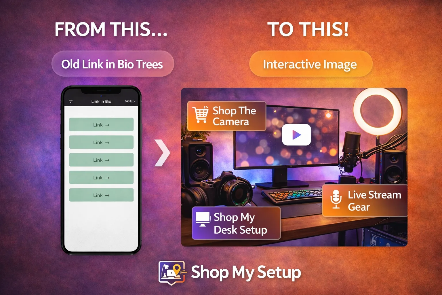
If you’re using a traditional link-in-bio tool, there’s a good chance you’re losing clicks without realizing it. Most creators send traffic to a page full of links and assume more options means more opportunity. In reality, it often does the opposite.
A wall of links forces visitors to stop, think, and choose. Every extra decision increases friction—and friction kills conversions.
Why Traditional Link-in-Bio Pages Fail
Link lists fail for three reasons:
Decision fatigue – too many choices with no guidance
No visual context – visitors don’t know what’s behind each link
No prioritization – everything looks equally important
When users hesitate, they leave.
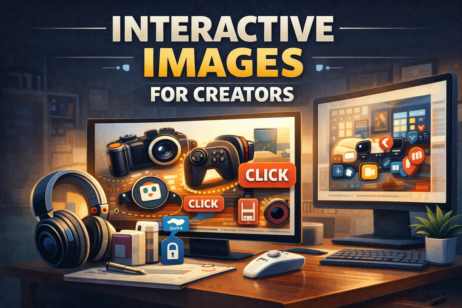
The Better Approach: Visual, Clickable Context
High-converting creators replace lists with visual context. Instead of asking users to read and decide, they let users click what they recognize.
One image. Multiple clickable hotspots. Zero confusion.
How Creators Do This Step by Step
Start with a single image (desk setup, studio, room, flat lay)
Add clickable hotspots to each item
Use one link everywhere instead of many
Match the image to the content people just watched or read
This turns curiosity into action instantly.
Why This Increases CTR
Visual recognition beats text scanning
Fewer choices mean faster clicks
Context removes doubt
You’re guiding attention instead of competing for it.
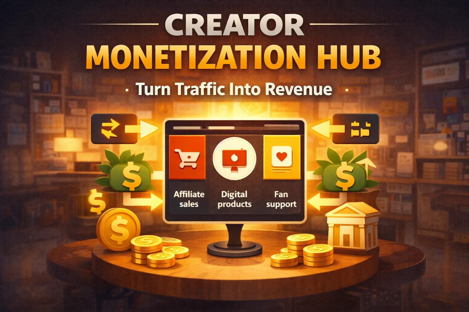
Free vs Pro
You can create a free interactive image with a single setup.
Pro unlocks branding removal, analytics, and multiple pages—useful once you’re optimizing.